UI / UX Design
MSME Admin Supervision Platform — Enterprise UX Case Study
An internal banking platform designed for three admin tiers: Zonal, FGMO, and CO, managing MSME operations nationally. Covers information architecture decisions, multilevel approval workflow design, accessibility in data dense interfaces, and measurable outcome data.
Year :
2025
Industry :
Fintech / Corporate Banking
Client :
Indian Bank
Project Overview :
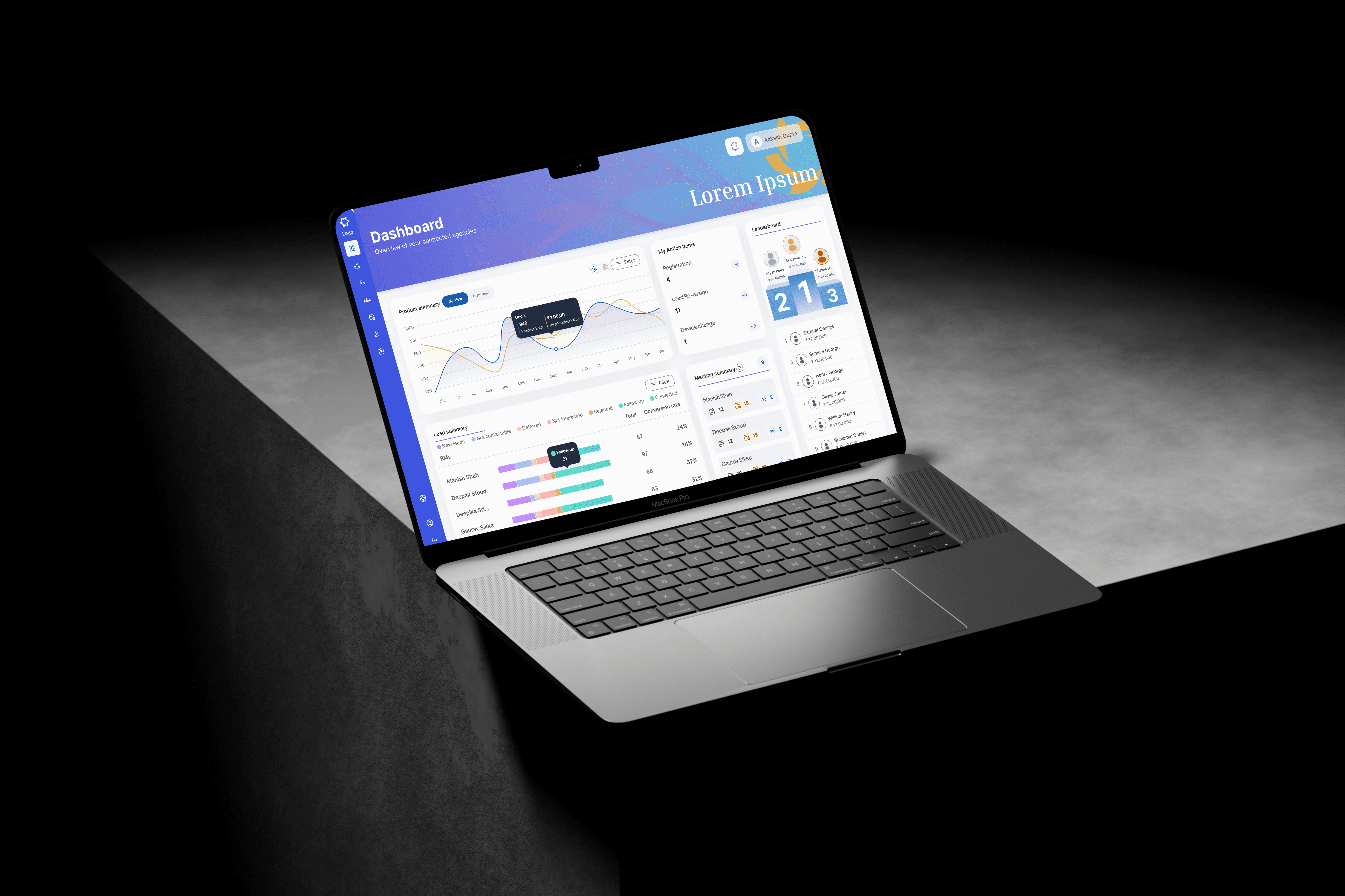
The MSME Admin Supervision Platform is a web-based internal application designed for the bank’s administrative hierarchy CO, FGMO, and Zonal Admins to oversee Relationship Managers (RMs) handling MSME clients.
Each admin level has specific permissions and tools:
Zonal Admins supervise RMs within their assigned zones.
FGMO Admins monitor zonal performance and regional trends.
CO Admins get a complete, organization-wide view of MSME operations.
The system enables better visibility, structured approval workflows, and data-driven decision-making — ensuring the MSME ecosystem runs efficiently at every level.
Scope & Role:
Platform exclusively for internal admins MSMEs and RMs cannot access it.
Role-based dashboards and workflows tailored for CO, FGMO, and Zonal users.
Designed directly in high-fidelity screens due to a tight project deadline.
Iterations were made based on admin feedback post-initial rollout.

Note : This user flow is a generalized representation of the actual process. Specific steps and system details have been intentionally omitted
Note : This user flow is a generalized representation of the actual process. Specific steps and system details have been intentionally omitted
Note : This user flow is a generalized representation of the actual process. Specific steps and system details have been intentionally omitted
THE PROBLEM
Managing a national MSME banking programme at scale is a coordination problem disguised as a data problem.
Before this platform, three levels of bank administration, Zonal Admins overseeing Relationship Managers in their region, FGMO Admins monitoring zone wide performance, and CO Admins responsible for the entire national operation, were each running their oversight function through a combination of spreadsheets, email chains, and manually assembled weekly reports. Decisions were always behind the data. Performance problems in a zone were identified weeks after they could have been addressed. New MSME onboarding approvals moved through the system based on individual availability rather than a structured workflow, averaging more than four days per approval.
The operational cost was clear. Bottlenecks that should have been identified within days took weeks to surface. Approvals that should have been traceable lacked an audit trail. Cross zone performance comparisons required a senior analyst to manually compile data from four separate sources.
The brief I was given was straightforward: Design a centralised web platform that provides all three admin tiers with real time visibility into MSME operations, a structured approval workflow, and the data tools required to perform their roles without manual effort.
What made this genuinely challenging was that it was not a dashboard project. The interface challenge was relatively straightforward compared to the underlying design problem. Three different roles were sharing a single system, each with a fundamentally different mental model of what oversight means. Designing for one role would compromise the needs of the other two. The real challenge was information architecture: deciding what each role should see, at what level of granularity, and in what structure, before a single screen could be designed.
UNDERSTANDING THREE DIFFERENT DEFINITIONS OF "OVERSIGHT"
The Business Analyst team conducted internal workshops with admin representatives across all three levels. When I reviewed those outputs, I realised the project had been framed as a permissions problem. who can see what, when the real challenge was a mental model problem: three roles that process information in fundamentally different ways.
I mapped each role's cognitive context before touching Figma.
Zonal Admin - the operational triage mindset
A Zonal Admin's day is reactive. Their mental model is a task queue: what needs my attention right now? Pending MSME approval requests, flagged RM activity, overdue follow-ups, zones with declining onboarding rates. They need density, a lot of information on one screen, because they're scanning for problems, not analysing trends. What creates noise for them: charts, trend lines, cross-zone comparisons. They don't need the national picture. They need to know which RM in their zone hasn't logged a client visit in two weeks.
FGMO Admin - the comparison mindset
An FGMO Admin thinks in relative terms: how is Zone A performing compared to Zone B, and what's causing the gap? Their primary need is aggregated data that enables ranking, comparison, and escalation. They interact with the platform less frequently than Zonal Admins but for longer, more analytical sessions, typically during weekly review cycles. They need trend data and zone rankings, but get overwhelmed by RM-level granularity that's irrelevant at their scope.
CO Admin - the strategic signal mindset
A CO Admin is looking for signals in national-scale noise: where are the risks, where are the opportunities, and what decisions do I need to make this week? They need macro-level exposure analytics, cross-region performance trends, and the ability to drill into anomalies, but starting from a high-level summary, not from RM-level detail. For a CO Admin, a screen full of individual records is not information. It's noise that hides the signal.
The insight that shaped the entire architecture: These three roles don't just need different data — they need different structures. Showing all three the same navigation, the same default screens, and the same data granularity but with different content visible would have been the easy solution and the wrong one. I designed each role's entry point and primary navigation as a distinct experience, not just a filtered version of one universal interface.


Note : Design screens have been recreated for portfolio purposes. Original confidential UI has been omitted
Note : Design screens have been recreated for portfolio purposes. Original confidential UI has been omitted
THE CORE DESIGN DECISIONS
Here's the rewritten version with hyphens removed and phrasing adjusted where needed:
Decision 1: Three landing experiences, not one filtered dashboard
The conventional enterprise approach to multi role platforms is a single dashboard architecture where access permissions determine visibility. I rejected this model for one specific reason: the structure of useful information differs by role, not just the content.
A Zonal Admin's most useful landing screen is a prioritised task queue: pending approvals first, flagged RMs second, then zone summary metrics. An FGMO Admin's most useful landing screen is a ranked zone performance grid: which zones are up, which are down, and what has changed since last week. A CO Admin's most useful landing screen is a national exposure summary with one click drill down.
These are not the same structure with different data. They are different structures that reflect different jobs. I designed three distinct landing experiences. Each opening page, primary navigation order, and default data view was role specific, while maintaining a shared visual language so the platform felt coherent to anyone who needed to operate across levels.
The trade off: this tripled the landing page design complexity and required more alignment time with stakeholders to get role specific hierarchy right. I addressed this by running separate review sessions with a representative from each admin tier rather than combined sessions. Combined sessions tend to converge on the most vocal role's preference, which in this case was Zonal Admins, the most numerous group.
Decision 2: The approval workflow as an accountability system, not a form
The existing MSME addition process had no structure. An RM submitted a request, it entered a shared email thread, and someone approved it when they got to it. There was no tracking, no documented rationale, no audit trail, and no compliance defensibility.
I designed the approval workflow as a three stage accountability system. At each stage, Zonal review, FGMO confirmation, and CO final approval for large accounts, the approving admin sees a structured checklist of verification criteria, a mandatory decision field (Approve, Return with reason, or Escalate), and a free text rationale field required on every decision, not just rejections.
Every decision is logged with a timestamp, admin name, role level, and rationale, creating a complete audit trail visible to CO Admins. This was not in the original brief. It emerged from a review session where a CO Admin described a recurring problem: MSME applications were being rejected at Zonal level for inconsistent reasons, and because no reason was documented, the same types of valid applications were being rejected repeatedly by different Zonal Admins applying different implicit criteria.
The audit trail turned the approval workflow from a routing system into a knowledge system. Over time, the logged rejection reasons become a reference for what good applications look like, reducing inconsistency without requiring top down rule updates.
Decision 3: Data visualisation calibrated to decision speed, not data completeness
Each admin tier needed different chart types because they make different kinds of decisions at different speeds.
Zonal Admins needed counts and lists: number of pending approvals, names of overdue RMs, and count of active MSMEs by status. I used data tables and status tagged lists rather than charts because their decisions are immediate: action or no action. Charts do not help when the answer is binary.
FGMO Admins needed ranked comparisons. I used horizontal bar charts for zone performance rankings specifically because they make relative position legible at a glance. A table of numbers forces mental comparison. A ranked bar chart makes the same comparison instant.
CO Admins needed trend lines and exposure maps. Their decisions are longer cycle, strategic rather than reactive, so temporal trends matter more than point in time snapshots. I used line charts with a configurable time window (7 days, 30 days, or quarter) that defaulted to 30 days based on their stated reporting cadence.
The unifying principle: match the visualisation type to the decision speed of the user, not to the data structure of the underlying system.
Decision 4: Focus mode for the approval workflow
High density dashboards create a well documented problem for consequential decisions: peripheral information activates divided attention. When a Zonal Admin is approving or rejecting an MSME addition, a compliance relevant decision with downstream consequences, I wanted them focused on that decision, not scanning the rest of the dashboard.
I designed a Focus Mode for the approval workflow, a full screen overlay that removes all navigation chrome, shows only the application detail and the decision checklist, and requires an explicit decision before returning to the dashboard. This was a deliberate cognitive choice: consequential decisions deserve dedicated screen states, not modals dropped on top of a busy interface.
Decision 5: Direct to high fidelity as a deliberate strategy
With a compressed timeline and daily access to admin stakeholders within the bank, I made a deliberate call to skip low fidelity wireframing and validate at high fidelity from the start. The risk this introduced, building in the wrong direction at high cost, was mitigated by running short, focused review sessions of 45 minutes with one representative from each admin tier every week throughout the design process.
This meant three parallel feedback tracks running simultaneously. The overhead was real, but it surfaced role specific issues before they compounded. In a more sequential process, a Zonal Admin's feedback in week 3 might invalidate FGMO design decisions made in week 1. The parallel track structure caught those conflicts early.


Note : Design screens have been recreated for portfolio purposes. Original confidential UI has been omitted
Note : Design screens have been recreated for portfolio purposes. Original confidential UI has been omitted
Outcomes :
Following rollout across two pilot zones in early 2025:
The headline metric: approval turnaround time for new MSME additions dropped from an average of 4.2 days to 1.8 days within the first month of rollout, as confirmed by the operations team. This was the single most tangible operational improvement attributable to the platform, driven primarily by the structured approval workflow replacing the email based process.
Additional outcomes observed and reported during post rollout review sessions:
Manual spreadsheet reporting was eliminated for Zonal Admins within the first month. The dashboard replaced the Monday morning report assembly process entirely.
CO Admins reported making regional resource allocation decisions from the platform's national analytics view during the first pilot cycle. This was the first time strategic decisions of that type were made using real time data rather than retrospective reports.
The audit trail within the approval workflow surfaced a pattern within the first six weeks: a specific document type was being rejected inconsistently across Zonal Admins. The documented rejection reasons made this visible in a way the email process never had, and a clarification was issued to all zones. This was a downstream quality improvement that emerged from the design of the system, not just the data it contained.
Zero requests were received from any admin tier to return to the previous manual process after the eight week pilot.
More Projects



UI / UX Design
MSME Admin Supervision Platform — Enterprise UX Case Study
An internal banking platform designed for three admin tiers: Zonal, FGMO, and CO, managing MSME operations nationally. Covers information architecture decisions, multilevel approval workflow design, accessibility in data dense interfaces, and measurable outcome data.
Year :
2025
Industry :
Fintech / Corporate Banking
Client :
Indian Bank
Project Overview :
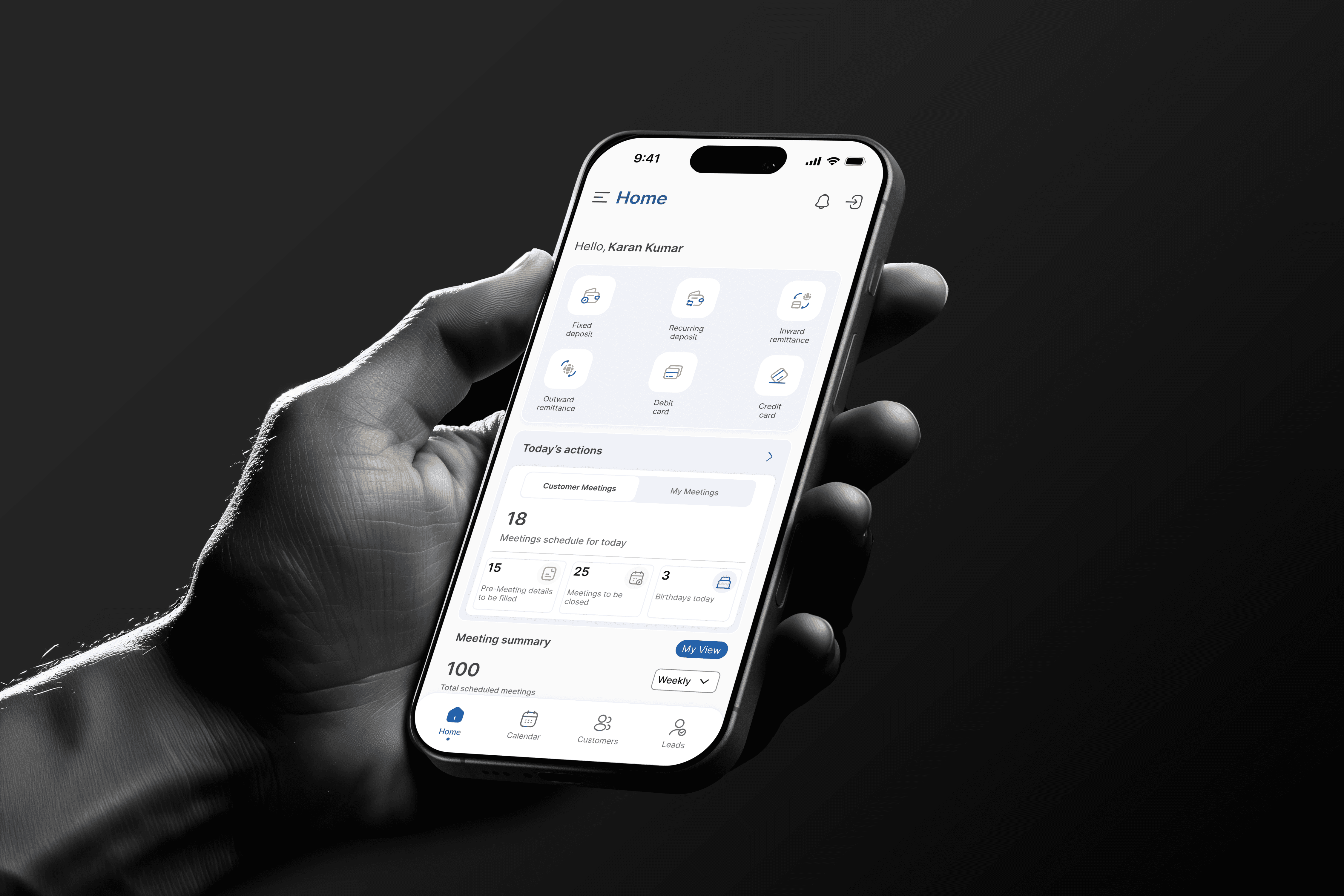
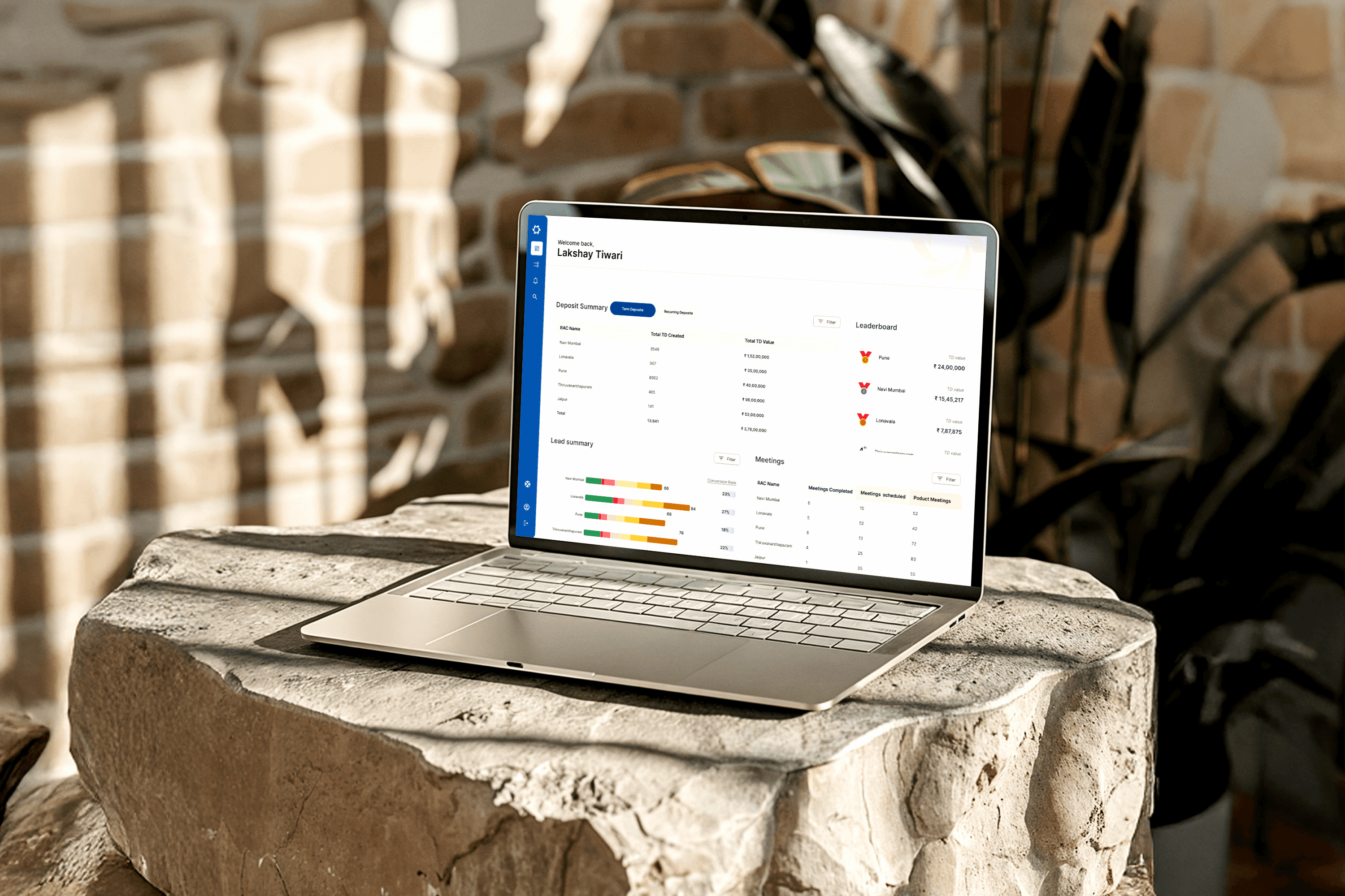
The MSME Admin Supervision Platform is a web-based internal application designed for the bank’s administrative hierarchy CO, FGMO, and Zonal Admins to oversee Relationship Managers (RMs) handling MSME clients.
Each admin level has specific permissions and tools:
Zonal Admins supervise RMs within their assigned zones.
FGMO Admins monitor zonal performance and regional trends.
CO Admins get a complete, organization-wide view of MSME operations.
The system enables better visibility, structured approval workflows, and data-driven decision-making — ensuring the MSME ecosystem runs efficiently at every level.
Scope & Role:
Platform exclusively for internal admins MSMEs and RMs cannot access it.
Role-based dashboards and workflows tailored for CO, FGMO, and Zonal users.
Designed directly in high-fidelity screens due to a tight project deadline.
Iterations were made based on admin feedback post-initial rollout.
Note : This user flow is a generalized representation of the actual process. Specific steps and system details have been intentionally omitted
Note : This user flow is a generalized representation of the actual process. Specific steps and system details have been intentionally omitted
Note : This user flow is a generalized representation of the actual process. Specific steps and system details have been intentionally omitted
THE PROBLEM
Managing a national MSME banking programme at scale is a coordination problem disguised as a data problem.
Before this platform, three levels of bank administration, Zonal Admins overseeing Relationship Managers in their region, FGMO Admins monitoring zone wide performance, and CO Admins responsible for the entire national operation, were each running their oversight function through a combination of spreadsheets, email chains, and manually assembled weekly reports. Decisions were always behind the data. Performance problems in a zone were identified weeks after they could have been addressed. New MSME onboarding approvals moved through the system based on individual availability rather than a structured workflow, averaging more than four days per approval.
The operational cost was clear. Bottlenecks that should have been identified within days took weeks to surface. Approvals that should have been traceable lacked an audit trail. Cross zone performance comparisons required a senior analyst to manually compile data from four separate sources.
The brief I was given was straightforward: Design a centralised web platform that provides all three admin tiers with real time visibility into MSME operations, a structured approval workflow, and the data tools required to perform their roles without manual effort.
What made this genuinely challenging was that it was not a dashboard project. The interface challenge was relatively straightforward compared to the underlying design problem. Three different roles were sharing a single system, each with a fundamentally different mental model of what oversight means. Designing for one role would compromise the needs of the other two. The real challenge was information architecture: deciding what each role should see, at what level of granularity, and in what structure, before a single screen could be designed.
UNDERSTANDING THREE DIFFERENT DEFINITIONS OF "OVERSIGHT"
The Business Analyst team conducted internal workshops with admin representatives across all three levels. When I reviewed those outputs, I realised the project had been framed as a permissions problem. who can see what, when the real challenge was a mental model problem: three roles that process information in fundamentally different ways.
I mapped each role's cognitive context before touching Figma.
Zonal Admin - the operational triage mindset
A Zonal Admin's day is reactive. Their mental model is a task queue: what needs my attention right now? Pending MSME approval requests, flagged RM activity, overdue follow-ups, zones with declining onboarding rates. They need density, a lot of information on one screen, because they're scanning for problems, not analysing trends. What creates noise for them: charts, trend lines, cross-zone comparisons. They don't need the national picture. They need to know which RM in their zone hasn't logged a client visit in two weeks.
FGMO Admin - the comparison mindset
An FGMO Admin thinks in relative terms: how is Zone A performing compared to Zone B, and what's causing the gap? Their primary need is aggregated data that enables ranking, comparison, and escalation. They interact with the platform less frequently than Zonal Admins but for longer, more analytical sessions, typically during weekly review cycles. They need trend data and zone rankings, but get overwhelmed by RM-level granularity that's irrelevant at their scope.
CO Admin - the strategic signal mindset
A CO Admin is looking for signals in national-scale noise: where are the risks, where are the opportunities, and what decisions do I need to make this week? They need macro-level exposure analytics, cross-region performance trends, and the ability to drill into anomalies, but starting from a high-level summary, not from RM-level detail. For a CO Admin, a screen full of individual records is not information. It's noise that hides the signal.
The insight that shaped the entire architecture: These three roles don't just need different data — they need different structures. Showing all three the same navigation, the same default screens, and the same data granularity but with different content visible would have been the easy solution and the wrong one. I designed each role's entry point and primary navigation as a distinct experience, not just a filtered version of one universal interface.
Note : Design screens have been recreated for portfolio purposes. Original confidential UI has been omitted
Note : Design screens have been recreated for portfolio purposes. Original confidential UI has been omitted
THE CORE DESIGN DECISIONS
Here's the rewritten version with hyphens removed and phrasing adjusted where needed:
Decision 1: Three landing experiences, not one filtered dashboard
The conventional enterprise approach to multi role platforms is a single dashboard architecture where access permissions determine visibility. I rejected this model for one specific reason: the structure of useful information differs by role, not just the content.
A Zonal Admin's most useful landing screen is a prioritised task queue: pending approvals first, flagged RMs second, then zone summary metrics. An FGMO Admin's most useful landing screen is a ranked zone performance grid: which zones are up, which are down, and what has changed since last week. A CO Admin's most useful landing screen is a national exposure summary with one click drill down.
These are not the same structure with different data. They are different structures that reflect different jobs. I designed three distinct landing experiences. Each opening page, primary navigation order, and default data view was role specific, while maintaining a shared visual language so the platform felt coherent to anyone who needed to operate across levels.
The trade off: this tripled the landing page design complexity and required more alignment time with stakeholders to get role specific hierarchy right. I addressed this by running separate review sessions with a representative from each admin tier rather than combined sessions. Combined sessions tend to converge on the most vocal role's preference, which in this case was Zonal Admins, the most numerous group.
Decision 2: The approval workflow as an accountability system, not a form
The existing MSME addition process had no structure. An RM submitted a request, it entered a shared email thread, and someone approved it when they got to it. There was no tracking, no documented rationale, no audit trail, and no compliance defensibility.
I designed the approval workflow as a three stage accountability system. At each stage, Zonal review, FGMO confirmation, and CO final approval for large accounts, the approving admin sees a structured checklist of verification criteria, a mandatory decision field (Approve, Return with reason, or Escalate), and a free text rationale field required on every decision, not just rejections.
Every decision is logged with a timestamp, admin name, role level, and rationale, creating a complete audit trail visible to CO Admins. This was not in the original brief. It emerged from a review session where a CO Admin described a recurring problem: MSME applications were being rejected at Zonal level for inconsistent reasons, and because no reason was documented, the same types of valid applications were being rejected repeatedly by different Zonal Admins applying different implicit criteria.
The audit trail turned the approval workflow from a routing system into a knowledge system. Over time, the logged rejection reasons become a reference for what good applications look like, reducing inconsistency without requiring top down rule updates.
Decision 3: Data visualisation calibrated to decision speed, not data completeness
Each admin tier needed different chart types because they make different kinds of decisions at different speeds.
Zonal Admins needed counts and lists: number of pending approvals, names of overdue RMs, and count of active MSMEs by status. I used data tables and status tagged lists rather than charts because their decisions are immediate: action or no action. Charts do not help when the answer is binary.
FGMO Admins needed ranked comparisons. I used horizontal bar charts for zone performance rankings specifically because they make relative position legible at a glance. A table of numbers forces mental comparison. A ranked bar chart makes the same comparison instant.
CO Admins needed trend lines and exposure maps. Their decisions are longer cycle, strategic rather than reactive, so temporal trends matter more than point in time snapshots. I used line charts with a configurable time window (7 days, 30 days, or quarter) that defaulted to 30 days based on their stated reporting cadence.
The unifying principle: match the visualisation type to the decision speed of the user, not to the data structure of the underlying system.
Decision 4: Focus mode for the approval workflow
High density dashboards create a well documented problem for consequential decisions: peripheral information activates divided attention. When a Zonal Admin is approving or rejecting an MSME addition, a compliance relevant decision with downstream consequences, I wanted them focused on that decision, not scanning the rest of the dashboard.
I designed a Focus Mode for the approval workflow, a full screen overlay that removes all navigation chrome, shows only the application detail and the decision checklist, and requires an explicit decision before returning to the dashboard. This was a deliberate cognitive choice: consequential decisions deserve dedicated screen states, not modals dropped on top of a busy interface.
Decision 5: Direct to high fidelity as a deliberate strategy
With a compressed timeline and daily access to admin stakeholders within the bank, I made a deliberate call to skip low fidelity wireframing and validate at high fidelity from the start. The risk this introduced, building in the wrong direction at high cost, was mitigated by running short, focused review sessions of 45 minutes with one representative from each admin tier every week throughout the design process.
This meant three parallel feedback tracks running simultaneously. The overhead was real, but it surfaced role specific issues before they compounded. In a more sequential process, a Zonal Admin's feedback in week 3 might invalidate FGMO design decisions made in week 1. The parallel track structure caught those conflicts early.
Note : Design screens have been recreated for portfolio purposes. Original confidential UI has been omitted
Note : Design screens have been recreated for portfolio purposes. Original confidential UI has been omitted
Outcomes :
Following rollout across two pilot zones in early 2025:
The headline metric: approval turnaround time for new MSME additions dropped from an average of 4.2 days to 1.8 days within the first month of rollout, as confirmed by the operations team. This was the single most tangible operational improvement attributable to the platform, driven primarily by the structured approval workflow replacing the email based process.
Additional outcomes observed and reported during post rollout review sessions:
Manual spreadsheet reporting was eliminated for Zonal Admins within the first month. The dashboard replaced the Monday morning report assembly process entirely.
CO Admins reported making regional resource allocation decisions from the platform's national analytics view during the first pilot cycle. This was the first time strategic decisions of that type were made using real time data rather than retrospective reports.
The audit trail within the approval workflow surfaced a pattern within the first six weeks: a specific document type was being rejected inconsistently across Zonal Admins. The documented rejection reasons made this visible in a way the email process never had, and a clarification was issued to all zones. This was a downstream quality improvement that emerged from the design of the system, not just the data it contained.
Zero requests were received from any admin tier to return to the previous manual process after the eight week pilot.
More Projects
UI / UX Design
MSME Admin Supervision Platform — Enterprise UX Case Study
An internal banking platform designed for three admin tiers: Zonal, FGMO, and CO, managing MSME operations nationally. Covers information architecture decisions, multilevel approval workflow design, accessibility in data dense interfaces, and measurable outcome data.
Year :
2025
Industry :
Fintech / Corporate Banking
Client :
Indian Bank
Project Overview :
The MSME Admin Supervision Platform is a web-based internal application designed for the bank’s administrative hierarchy CO, FGMO, and Zonal Admins to oversee Relationship Managers (RMs) handling MSME clients.
Each admin level has specific permissions and tools:
Zonal Admins supervise RMs within their assigned zones.
FGMO Admins monitor zonal performance and regional trends.
CO Admins get a complete, organization-wide view of MSME operations.
The system enables better visibility, structured approval workflows, and data-driven decision-making — ensuring the MSME ecosystem runs efficiently at every level.
Scope & Role:
Platform exclusively for internal admins MSMEs and RMs cannot access it.
Role-based dashboards and workflows tailored for CO, FGMO, and Zonal users.
Designed directly in high-fidelity screens due to a tight project deadline.
Iterations were made based on admin feedback post-initial rollout.
Note : This user flow is a generalized representation of the actual process. Specific steps and system details have been intentionally omitted
Note : This user flow is a generalized representation of the actual process. Specific steps and system details have been intentionally omitted
Note : This user flow is a generalized representation of the actual process. Specific steps and system details have been intentionally omitted
THE PROBLEM
Managing a national MSME banking programme at scale is a coordination problem disguised as a data problem.
Before this platform, three levels of bank administration, Zonal Admins overseeing Relationship Managers in their region, FGMO Admins monitoring zone wide performance, and CO Admins responsible for the entire national operation, were each running their oversight function through a combination of spreadsheets, email chains, and manually assembled weekly reports. Decisions were always behind the data. Performance problems in a zone were identified weeks after they could have been addressed. New MSME onboarding approvals moved through the system based on individual availability rather than a structured workflow, averaging more than four days per approval.
The operational cost was clear. Bottlenecks that should have been identified within days took weeks to surface. Approvals that should have been traceable lacked an audit trail. Cross zone performance comparisons required a senior analyst to manually compile data from four separate sources.
The brief I was given was straightforward: Design a centralised web platform that provides all three admin tiers with real time visibility into MSME operations, a structured approval workflow, and the data tools required to perform their roles without manual effort.
What made this genuinely challenging was that it was not a dashboard project. The interface challenge was relatively straightforward compared to the underlying design problem. Three different roles were sharing a single system, each with a fundamentally different mental model of what oversight means. Designing for one role would compromise the needs of the other two. The real challenge was information architecture: deciding what each role should see, at what level of granularity, and in what structure, before a single screen could be designed.
UNDERSTANDING THREE DIFFERENT DEFINITIONS OF "OVERSIGHT"
The Business Analyst team conducted internal workshops with admin representatives across all three levels. When I reviewed those outputs, I realised the project had been framed as a permissions problem. who can see what, when the real challenge was a mental model problem: three roles that process information in fundamentally different ways.
I mapped each role's cognitive context before touching Figma.
Zonal Admin - the operational triage mindset
A Zonal Admin's day is reactive. Their mental model is a task queue: what needs my attention right now? Pending MSME approval requests, flagged RM activity, overdue follow-ups, zones with declining onboarding rates. They need density, a lot of information on one screen, because they're scanning for problems, not analysing trends. What creates noise for them: charts, trend lines, cross-zone comparisons. They don't need the national picture. They need to know which RM in their zone hasn't logged a client visit in two weeks.
FGMO Admin - the comparison mindset
An FGMO Admin thinks in relative terms: how is Zone A performing compared to Zone B, and what's causing the gap? Their primary need is aggregated data that enables ranking, comparison, and escalation. They interact with the platform less frequently than Zonal Admins but for longer, more analytical sessions, typically during weekly review cycles. They need trend data and zone rankings, but get overwhelmed by RM-level granularity that's irrelevant at their scope.
CO Admin - the strategic signal mindset
A CO Admin is looking for signals in national-scale noise: where are the risks, where are the opportunities, and what decisions do I need to make this week? They need macro-level exposure analytics, cross-region performance trends, and the ability to drill into anomalies, but starting from a high-level summary, not from RM-level detail. For a CO Admin, a screen full of individual records is not information. It's noise that hides the signal.
The insight that shaped the entire architecture: These three roles don't just need different data — they need different structures. Showing all three the same navigation, the same default screens, and the same data granularity but with different content visible would have been the easy solution and the wrong one. I designed each role's entry point and primary navigation as a distinct experience, not just a filtered version of one universal interface.
Note : Design screens have been recreated for portfolio purposes. Original confidential UI has been omitted
Note : Design screens have been recreated for portfolio purposes. Original confidential UI has been omitted
THE CORE DESIGN DECISIONS
Here's the rewritten version with hyphens removed and phrasing adjusted where needed:
Decision 1: Three landing experiences, not one filtered dashboard
The conventional enterprise approach to multi role platforms is a single dashboard architecture where access permissions determine visibility. I rejected this model for one specific reason: the structure of useful information differs by role, not just the content.
A Zonal Admin's most useful landing screen is a prioritised task queue: pending approvals first, flagged RMs second, then zone summary metrics. An FGMO Admin's most useful landing screen is a ranked zone performance grid: which zones are up, which are down, and what has changed since last week. A CO Admin's most useful landing screen is a national exposure summary with one click drill down.
These are not the same structure with different data. They are different structures that reflect different jobs. I designed three distinct landing experiences. Each opening page, primary navigation order, and default data view was role specific, while maintaining a shared visual language so the platform felt coherent to anyone who needed to operate across levels.
The trade off: this tripled the landing page design complexity and required more alignment time with stakeholders to get role specific hierarchy right. I addressed this by running separate review sessions with a representative from each admin tier rather than combined sessions. Combined sessions tend to converge on the most vocal role's preference, which in this case was Zonal Admins, the most numerous group.
Decision 2: The approval workflow as an accountability system, not a form
The existing MSME addition process had no structure. An RM submitted a request, it entered a shared email thread, and someone approved it when they got to it. There was no tracking, no documented rationale, no audit trail, and no compliance defensibility.
I designed the approval workflow as a three stage accountability system. At each stage, Zonal review, FGMO confirmation, and CO final approval for large accounts, the approving admin sees a structured checklist of verification criteria, a mandatory decision field (Approve, Return with reason, or Escalate), and a free text rationale field required on every decision, not just rejections.
Every decision is logged with a timestamp, admin name, role level, and rationale, creating a complete audit trail visible to CO Admins. This was not in the original brief. It emerged from a review session where a CO Admin described a recurring problem: MSME applications were being rejected at Zonal level for inconsistent reasons, and because no reason was documented, the same types of valid applications were being rejected repeatedly by different Zonal Admins applying different implicit criteria.
The audit trail turned the approval workflow from a routing system into a knowledge system. Over time, the logged rejection reasons become a reference for what good applications look like, reducing inconsistency without requiring top down rule updates.
Decision 3: Data visualisation calibrated to decision speed, not data completeness
Each admin tier needed different chart types because they make different kinds of decisions at different speeds.
Zonal Admins needed counts and lists: number of pending approvals, names of overdue RMs, and count of active MSMEs by status. I used data tables and status tagged lists rather than charts because their decisions are immediate: action or no action. Charts do not help when the answer is binary.
FGMO Admins needed ranked comparisons. I used horizontal bar charts for zone performance rankings specifically because they make relative position legible at a glance. A table of numbers forces mental comparison. A ranked bar chart makes the same comparison instant.
CO Admins needed trend lines and exposure maps. Their decisions are longer cycle, strategic rather than reactive, so temporal trends matter more than point in time snapshots. I used line charts with a configurable time window (7 days, 30 days, or quarter) that defaulted to 30 days based on their stated reporting cadence.
The unifying principle: match the visualisation type to the decision speed of the user, not to the data structure of the underlying system.
Decision 4: Focus mode for the approval workflow
High density dashboards create a well documented problem for consequential decisions: peripheral information activates divided attention. When a Zonal Admin is approving or rejecting an MSME addition, a compliance relevant decision with downstream consequences, I wanted them focused on that decision, not scanning the rest of the dashboard.
I designed a Focus Mode for the approval workflow, a full screen overlay that removes all navigation chrome, shows only the application detail and the decision checklist, and requires an explicit decision before returning to the dashboard. This was a deliberate cognitive choice: consequential decisions deserve dedicated screen states, not modals dropped on top of a busy interface.
Decision 5: Direct to high fidelity as a deliberate strategy
With a compressed timeline and daily access to admin stakeholders within the bank, I made a deliberate call to skip low fidelity wireframing and validate at high fidelity from the start. The risk this introduced, building in the wrong direction at high cost, was mitigated by running short, focused review sessions of 45 minutes with one representative from each admin tier every week throughout the design process.
This meant three parallel feedback tracks running simultaneously. The overhead was real, but it surfaced role specific issues before they compounded. In a more sequential process, a Zonal Admin's feedback in week 3 might invalidate FGMO design decisions made in week 1. The parallel track structure caught those conflicts early.
Note : Design screens have been recreated for portfolio purposes. Original confidential UI has been omitted
Note : Design screens have been recreated for portfolio purposes. Original confidential UI has been omitted
Outcomes :
Following rollout across two pilot zones in early 2025:
The headline metric: approval turnaround time for new MSME additions dropped from an average of 4.2 days to 1.8 days within the first month of rollout, as confirmed by the operations team. This was the single most tangible operational improvement attributable to the platform, driven primarily by the structured approval workflow replacing the email based process.
Additional outcomes observed and reported during post rollout review sessions:
Manual spreadsheet reporting was eliminated for Zonal Admins within the first month. The dashboard replaced the Monday morning report assembly process entirely.
CO Admins reported making regional resource allocation decisions from the platform's national analytics view during the first pilot cycle. This was the first time strategic decisions of that type were made using real time data rather than retrospective reports.
The audit trail within the approval workflow surfaced a pattern within the first six weeks: a specific document type was being rejected inconsistently across Zonal Admins. The documented rejection reasons made this visible in a way the email process never had, and a clarification was issued to all zones. This was a downstream quality improvement that emerged from the design of the system, not just the data it contained.
Zero requests were received from any admin tier to return to the previous manual process after the eight week pilot.